Wedding Color Palette Ideas
Planning your wedding colors feels exciting… and overwhelming. There are so many shades. So many moods. So many Pinterest boards.
The right wedding color palette ideas help everything feel connected. Your florals, linens, bridesmaid dresses, candles, even your photos. When colors work together, the whole day looks polished without feeling forced.
Below are 17 practical, scroll-worthy ways to build a palette that feels beautiful and personal.
1. Curate Layered Swatch Boards

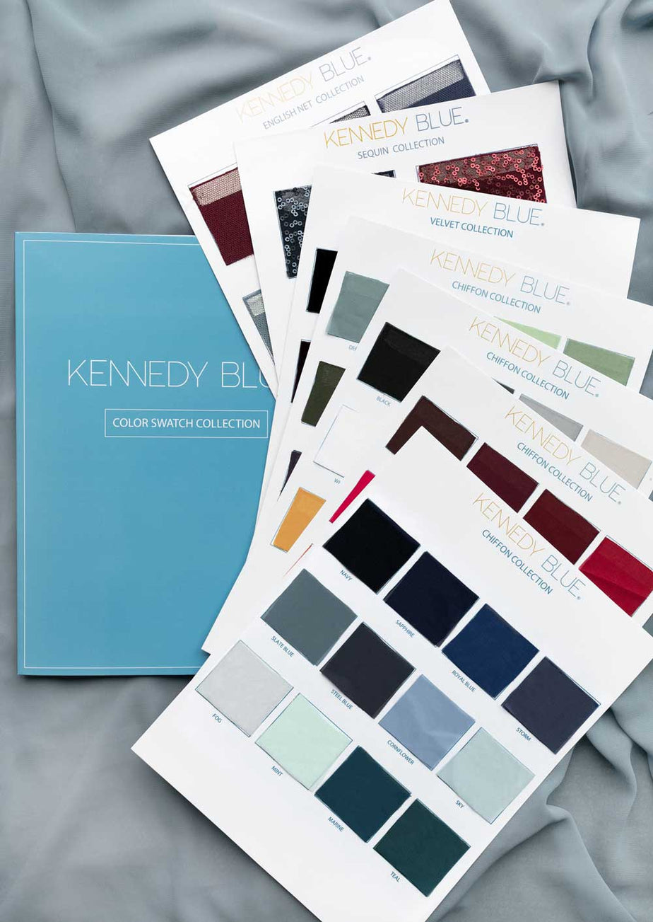


Start with texture, not just color. Layer fabric swatches, ribbon pieces, dried blooms, and paper samples together. Seeing them side by side shows how tones actually interact in real light.
- Pull 5–7 fabric samples in similar tone families
- Add one contrasting texture like velvet or linen
- Include a floral sample that matches your bouquet vision
- Photograph the board in natural daylight
- Remove anything that feels “loud”
Extra tip: Build it on neutral foam board so colors stand out.
Why it works: You see depth and balance before spending money.
2. Pair Seasonal Color Duos


Each season already suggests strong pairings. Instead of choosing four random colors, start with two that reflect the time of year.
- Fall: rust + burgundy
- Spring: peach + powder blue
- Summer: coral + butter yellow
- Winter: emerald + gold
- Add white or beige to soften
Extra tip: Look at seasonal flowers available locally.
Why it works: Nature already balanced those shades.
3. Blend Warm Neutral Tones


Warm neutrals feel calm and expensive. Think sand, taupe, champagne, ivory.
- Mix at least three neutral tones
- Add wood accents for warmth
- Use textured napkins to avoid flatness
- Keep florals creamy, not stark white
- Add soft candlelight
Extra suggestion: Avoid mixing cool gray with warm beige.
Why it works: Depth replaces the need for bold color.
4. Mix Romantic Blush Hues


Blush can look soft or too sweet. The trick is layering tones.
- Combine dusty rose + muted mauve
- Add cream to prevent pink overload
- Use greenery to ground the palette
- Keep metallic accents subtle
- Avoid neon undertones
You can explore more soft theme ideas to build around blush.
Why it works: Variations keep pink sophisticated.
5. Layer Terracotta Accents


Terracotta brings warmth and depth without feeling bright.
- Pair rust with beige or sage
- Use clay pots for table styling
- Add dried florals for texture
- Avoid mixing with cool blues
- Keep table linens light
Extra tip: Terracotta looks beautiful in outdoor weddings.
Why it works: Earth tones photograph beautifully at golden hour.
6. Combine Bold Jewel Tones


Jewel tones feel rich and dramatic.
- Pick one hero shade (emerald, navy, plum)
- Add one supporting jewel tone
- Balance with gold or brass
- Use dark tablecloths for drama
- Keep florals structured
See elegant centerpiece ideas to match bold tones.
Why it works: Deep shades create instant luxury.
7. Balance Crisp White Palettes


White can look clean or empty. Texture makes the difference.
- Mix matte and glossy finishes
- Add ivory, not only bright white
- Include glass and clear acrylic
- Layer soft linens
- Add greenery for life
Extra suggestion: Use candle clusters for warmth.
Why it works: Texture replaces color contrast.
8. Style Moody Evening Palettes


Evening weddings allow darker palettes.
- Choose navy, charcoal, or deep plum
- Add candlelight generously
- Use metallic cutlery
- Keep florals slightly dramatic
- Avoid pastel accents
Extra tip: Test lighting before finalizing shades.
Why it works: Dim light enhances deep colors.
9. Blend Coastal Blue Shades


Blue feels calm and timeless.
- Combine dusty blue + soft sky
- Add ivory for softness
- Include light wood elements
- Keep florals airy
- Avoid pairing with harsh red
Extra suggestion: Add shells subtly for beach themes.
Why it works: Blue feels fresh in photos.
10. Build Monochrome Table Settings


Monochrome does not mean boring.
- Use 4 shades of the same color
- Mix fabrics and finishes
- Add small pattern variation
- Keep centerpieces tonal
- Use different heights
Extra tip: Keep one contrasting detail like greenery.
Why it works: Tone variation creates elegance.
11. Create Pastel Spring Blends


Pastels feel light and romantic.
- Combine 3 soft tones max
- Keep one color dominant
- Use fresh seasonal blooms
- Avoid adding dark accents
- Keep linens neutral
Extra suggestion: Soft ribbons elevate bouquets.
Why it works: Light tones reflect natural daylight beautifully.
12. Add Metallic Accent Layers


Metallics should enhance, not overpower.
- Pick one metal only
- Repeat it in small details
- Pair gold with warm tones
- Pair silver with cool tones
- Avoid mixing too many finishes
Extra tip: Use metallic frames for signage.
Why it works: Shine draws the eye subtly.
13. Fade Ombre Floral Gradients


Ombre adds movement.
- Choose one color family
- Fade from light to dark
- Keep table decor simple
- Avoid mixing random colors
- Test bouquet samples first
Extra suggestion: Use ombre in ceremony arches.
Why it works: Gradients feel artistic yet cohesive.
14. Style Sunset Gradient Tones


Sunset palettes feel warm and emotional.
- Blend coral, peach, and soft plum
- Add gold accents
- Keep linens neutral
- Avoid cool blues
- Use warm candlelight
Extra tip: Perfect for outdoor receptions.
Why it works: Warm shades glow in photos.
15. Layer Nature Inspired Greens


Green is timeless and fresh.
- Mix sage + olive
- Add white florals
- Use wood or rattan
- Avoid pairing with bright neon tones
- Add natural textures
Extra suggestion: Works well for garden venues.
Why it works: Green feels grounded and classic.
16. Mix Two Tone Tablescapes


Two-tone setups look intentional.
- Divide colors by table elements
- Keep florals neutral
- Repeat colors across the room
- Avoid adding a third dominant shade
- Use matching candles
Extra tip: Test one sample table first.
Why it works: Clear contrast feels styled, not messy.
17. Block Statement Color Contrasts


Bold contrasts feel modern.
- Choose two strong colors only
- Keep decor minimal
- Repeat contrast in signage
- Use structured florals
- Avoid extra accent colors
Explore bold styling with creative [bridesmaid dress ideas] for contrast balance.
Why it works: Simplicity makes bold look intentional.
Small Details That Matter
- Using too many main colors
- Mixing warm and cool tones randomly
- Ignoring lighting conditions
- Forgetting fabric texture
- Overusing metallic accents
FAQs
How do I choose wedding colors?
Start with the season and venue. Pull inspiration from flowers in bloom. Build a swatch board. Remove one color if it feels crowded.
How many colors should I use?
Two main shades plus one accent works best. More than four feels busy.
What colors look timeless?
Ivory, sage, blush, navy, champagne, and soft gray remain classic year after year.
Seasonal palette combinations?
Spring: blush + mint
Summer: coral + peach
Fall: rust + burgundy
Winter: emerald + gold
Matching florals with palette?
Choose flowers that naturally exist in your color family. Ask your florist for seasonal options from trusted resources like Brides.com or MarthaStewart.com for guidance.
Conclusion
Beautiful wedding color palette ideas make every detail feel connected. Start simple. Layer thoughtfully. Test combinations in natural light. Keep textures balanced.
For more decor inspiration and styling guides, explore our full collection at /wedding/decor/ and discover more theme ideas and centerpiece ideas to complete your look.
Choose colors that feel like you. That is what guests will remember most.
Focus Keyphrase
Wedding Color Palette Ideas
Keyphrase Synonym (1)
Wedding color schemes
Related Keyphrase (1)
Wedding color combinations
Primary H1
Wedding Color Palette Ideas for a Beautiful Day
Alternative H1s
- Wedding Color Palette Ideas That Feel Elegant
- Wedding Color Palette Ideas for a Cohesive Look
- Wedding Color Palette Ideas to Match Your Style
Meta Titles (3)
- How to Choose the Perfect Wedding Color Palette
- Beautiful Wedding Color Schemes Made Simple
- Wedding Color Combinations That Always Work
Power Title (1)
17 Wedding Color Palette Ideas Brides Love Right Now
Meta Description
Discover wedding color palette ideas that feel balanced and timeless. Learn how to mix tones, match florals, and style your day beautifully.
Slug / URL
wedding-color-palette
Intro Paragraph
Wedding color palette ideas can feel exciting but also confusing. There are so many shades to choose from. The right mix makes your flowers, table decor, and outfits feel connected. This guide helps you pick colors that match your season, venue, and style. Simple steps. Clear direction. A palette that feels truly yours.
Conclusion Paragraph
The best wedding color palette ideas feel natural and balanced. Choose tones that reflect your season and personality. Keep it simple and layer thoughtfully. When colors work together, everything looks polished without trying too hard. For more styling inspiration and decor planning tips, explore /wedding/decor/ and build a look that feels beautiful from start to finish.