Wedding Planning Aesthetic: How to Create a Cohesive, Pinterest-Worthy Wedding Look
Planning a wedding aesthetic is not about copying trends. It’s about creating a feeling that looks beautiful, photographs well, and feels like you. When colors, textures, lighting, and décor work together, everything feels calm and intentional. This guide walks you through simple, practical steps to build a cohesive wedding style that looks stunning both in real life and on Pinterest — without stress or confusion.
1. Build Cohesive Color Mood Board


Start with a clear visual direction before buying anything. A mood board helps you see how colors feel together. Choose one main tone, one supporting color, and one soft accent. Keep your palette simple so the eye feels relaxed. Your mood board becomes your reference point for every decision later, from flowers to table styling.
- Pick 2–3 core colors only
- Add texture samples next to color swatches
- Include photos of real weddings you love
- Keep tones similar in warmth (warm or cool)
- Save everything in one folder or board
Pro tip: Use screenshots from Pinterest instead of random images so the style already feels cohesive.
Why it works: A clear visual guide prevents mismatched décor decisions later.
2. Layer Curated Fabric Swatches


Fabrics quietly shape the mood of a wedding. Soft linen feels relaxed, while satin feels formal. Mixing textures adds depth without needing too many colors. Lay your fabric samples together and observe how light hits each piece. This step helps you avoid a flat or boring look when decorating the venue.
- Combine matte and soft-shine fabrics
- Keep textures within the same style family
- Test fabrics under natural light
- Match napkins with table runners
- Use flowing fabrics for romantic movement
Pro tip: Bring swatches during vendor meetings so everyone follows the same vision.
Why it works: Texture creates richness even with a minimal color palette.
3. Mix Signature Floral Palettes


Flowers should feel like part of the story, not random decorations. Select two main flower styles and one filler type to maintain consistency. Avoid using too many colors. Soft blending creates elegance while still looking natural. Think about bouquet, aisle flowers, and centerpieces together instead of separately.
- Pick blooms with similar tones
- Mix large and small flower heads
- Add greenery for softness
- Repeat floral colors across spaces
- Keep one flower type as the hero
Pro tip: Ask your florist for flowers that match your wedding color palette ideas instead of exact flower names.
Why it works: Repeating tones makes photos feel polished and intentional.
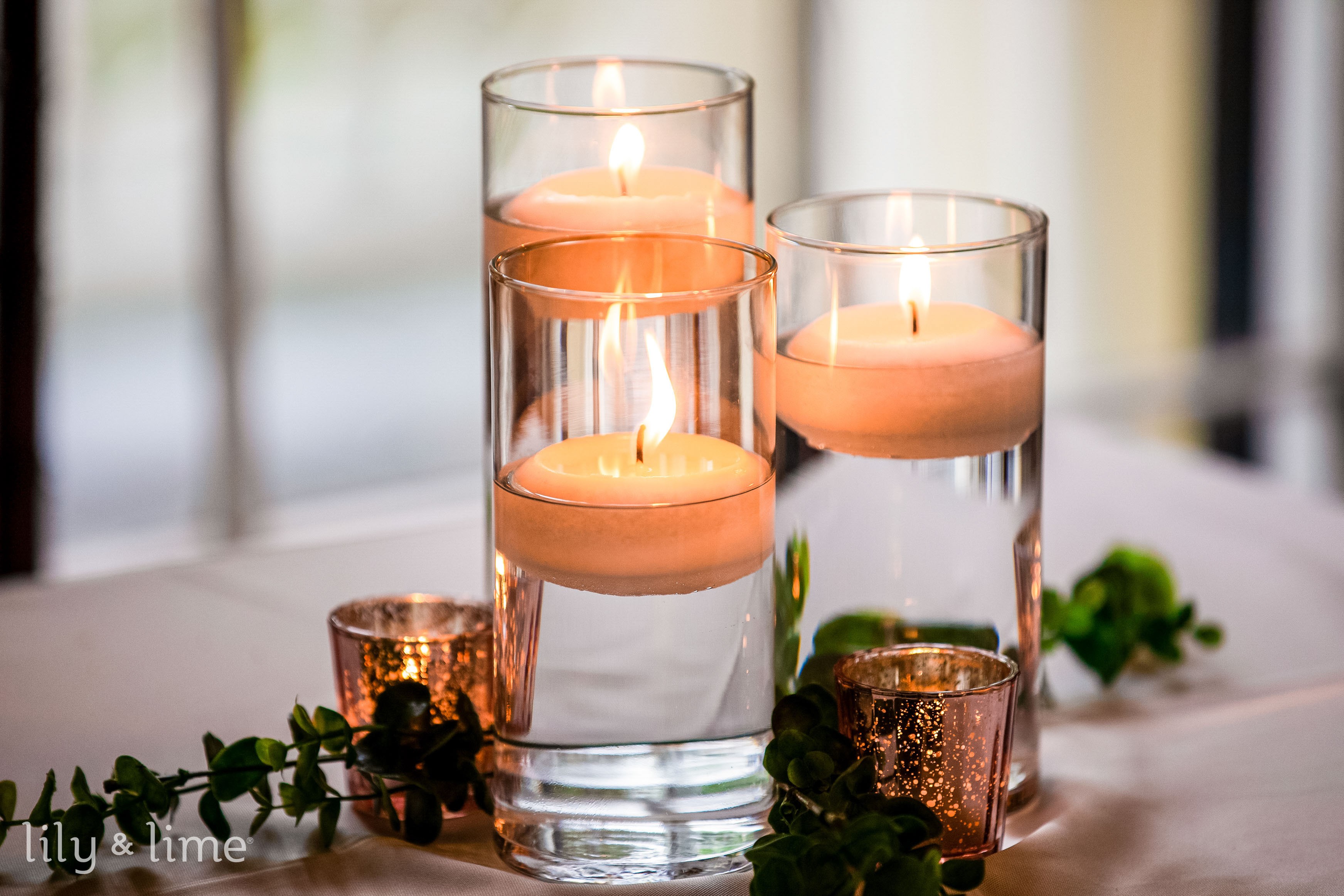
4. Define Venue Lighting Mood


Lighting changes everything. The same décor can feel magical or dull depending on the glow. Warm lighting creates romance, while harsh white lights remove intimacy. Think about sunset, evening, and dance-floor mood. Lighting should support your aesthetic instead of competing with it.
- Choose warm bulbs over bright white
- Add candles for soft depth
- Highlight key areas like tables or aisle
- Use dimmers if possible
- Test lighting before event day
Pro tip: Plan lighting early — it should guide décor choices, not come last.
Why it works: Soft lighting blends elements together and makes photos look dreamy.
5. Select Signature Decor Accents


Decor accents are small details guests remember — candle holders, vases, ribbons, or textured chargers. Choose a few repeatable pieces and use them throughout the venue. This creates visual rhythm and instantly ties everything together. For inspiration, use a saved vision board and collect ideas before shopping.
- Select 2–3 repeat accents
- Keep finishes consistent (matte or shiny)
- Match accents with color tones
- Avoid mixing too many shapes
- Repeat accents across ceremony and reception
Pro tip: If one accent appears in three different spaces, the whole wedding feels styled.
Why it works: Repetition builds harmony without extra cost.
6. Blend Seasonal Flower Tones


Seasonal colors always feel more natural and timeless. Spring works well with blush and soft peach, while autumn loves warm neutrals and deeper shades. Instead of fighting the season, use it as inspiration. Seasonal blooms often cost less and look fresher too.
- Match flower tones to season light
- Use local flowers when possible
- Avoid forcing out-of-season colors
- Blend shades instead of exact matches
- Add natural greens for balance
Pro tip: Ask for tone families, not strict colors, when ordering flowers.
Why it works: Seasonal tones automatically feel cohesive and believable.
7. Balance Modern and Romantic Layers


Many couples love clean modern lines but also want warmth. The secret is layering. Keep furniture simple and add romantic touches through fabrics, florals, or candles. This balance prevents the wedding from feeling too cold or overly traditional. Use your saved decor inspiration ideas to keep direction clear.
- Pair clean tables with soft florals
- Use neutral bases for flexibility
- Add curves through flowers or draping
- Keep color palette soft
- Limit bold patterns
Pro tip: Let modern structure lead and romance soften the edges.
Why it works: Contrast adds personality while keeping elegance.
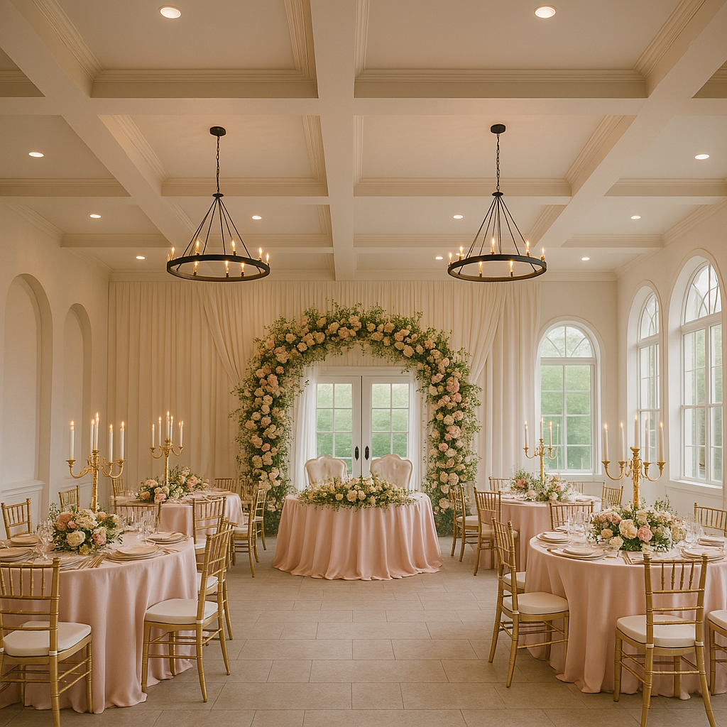
8. Highlight Statement Focal Pieces


A few strong focal points create Pinterest-worthy visuals. Think ceremony arch, sweetheart table, or hanging floral installation. Instead of decorating every inch, invest in one or two memorable areas. Guests naturally gather and take photos there, giving your wedding a strong visual identity.
- Choose one hero area per space
- Use larger floral scale there
- Add lighting to highlight it
- Keep surrounding décor simpler
- Make focal pieces photo-friendly
Pro tip: Position focal pieces where photographers naturally shoot.
Why it works: Big visual anchors make the whole design feel intentional.
9. Pair Textures with Metallic Accents


Metallic touches add polish when used lightly. Gold, brass, or silver can elevate even simple tables. The trick is balance — mix metallic shine with soft textures so the look stays elegant instead of flashy. A small touch goes a long way.
- Choose one metallic tone only
- Repeat metal finish across items
- Pair with linen or matte fabrics
- Use metallic candles or cutlery
- Keep shine subtle
Pro tip: Metallics should highlight — not dominate — your palette.
Why it works: Contrast between matte and shine adds visual richness.
10. Frame Aesthetic with Signage Style


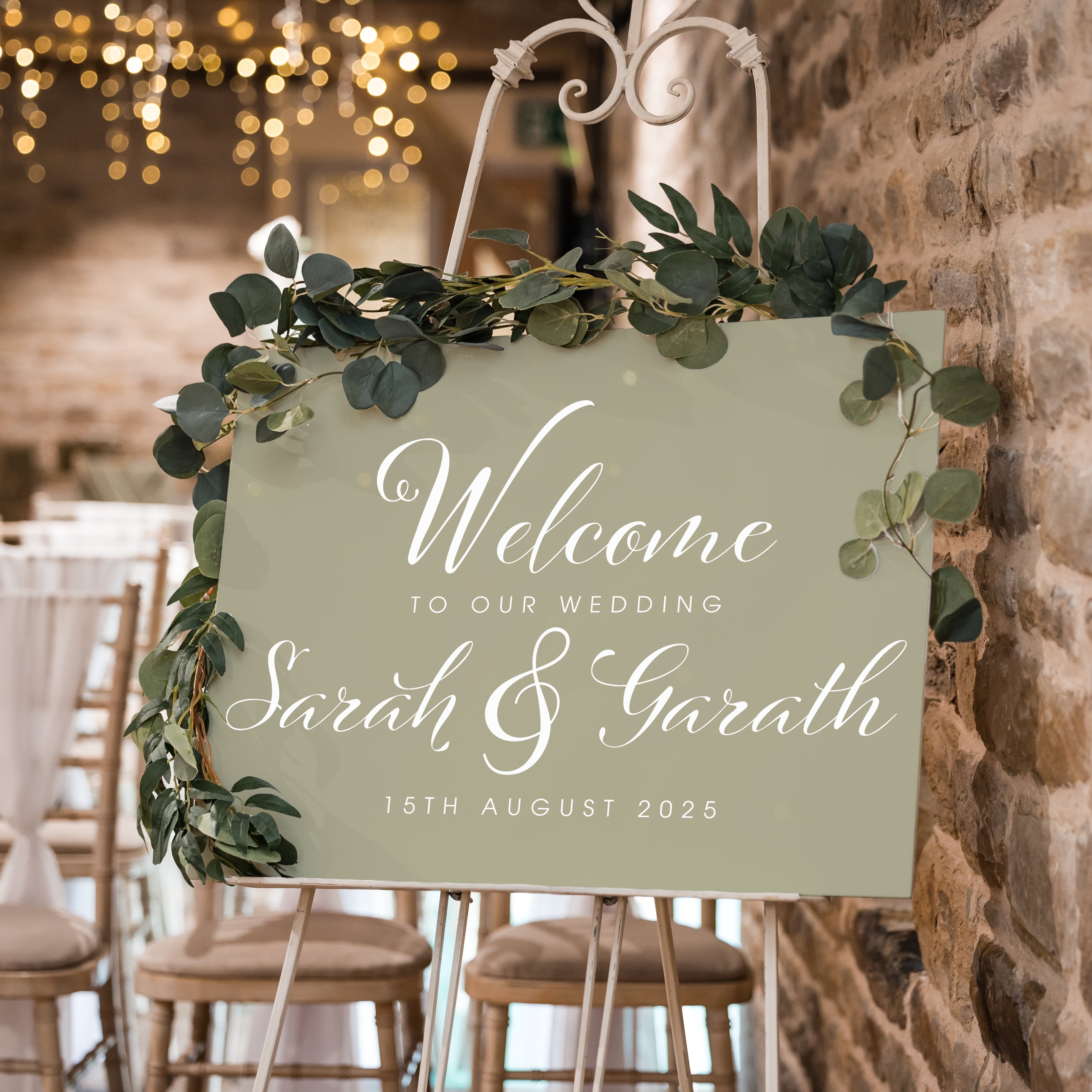
Signage quietly ties the entire aesthetic together. Fonts, materials, and colors should match your theme. Acrylic suits modern weddings, while wood or fabric signs feel romantic. Keep text clean so photos look timeless. This is also where your brand-style wedding identity really shows.
- Pick one font family
- Match sign color with palette
- Keep layouts simple
- Use consistent frames or stands
- Coordinate seating chart style
Pro tip: Think of signage like accessories — small but defining.
Why it works: Consistent typography makes the whole event feel designed.
11. Add Lounge and Candle Concepts


Lounge areas add warmth and encourage guests to relax. Soft seating with candles creates cozy corners that look beautiful in photos. You don’t need a huge setup — even one styled area works. Focus on comfort, soft lighting, and small décor details.
- Use neutral seating tones
- Add layered pillows or throws
- Cluster candles in groups
- Include a small floral touch
- Place lounge near dance floor
Pro tip: Arrange seating like a living room for natural conversation.
Why it works: Cozy spaces make the wedding feel inviting and lived-in.
12. Refine Mood with Sample Table Layouts


Before the big day, create one sample table layout. Seeing everything together helps you adjust spacing, color balance, and decorations. Small tweaks here can save stress later. This step is essential for achieving that polished Pinterest look.
- Set full place setting once
- Photograph from different angles
- Adjust height of centerpieces
- Remove anything cluttered
- Check lighting reflection
Pro tip: Use phone photos to spot imbalance quickly.
Why it works: Testing avoids last-minute styling surprises.
13. Capture Aesthetic in Venue Mockups


A simple venue mockup helps you visualize flow and spacing. Walk through ceremony to reception as if you were a guest. Notice empty areas or overcrowded spots. This planning step keeps your design cohesive from entrance to exit.
- Sketch layout before setup
- Test walkway spacing
- Mark focal areas
- Check guest sightlines
- Adjust décor scale to room size
Pro tip: Take wide photos to understand balance.
Why it works: Planning the flow makes the décor feel connected.
14. Align Aesthetic with Dress Silhouette
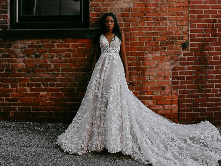

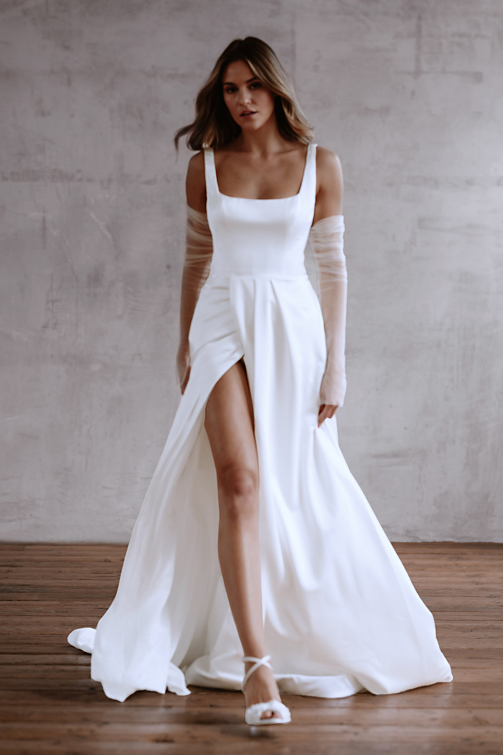
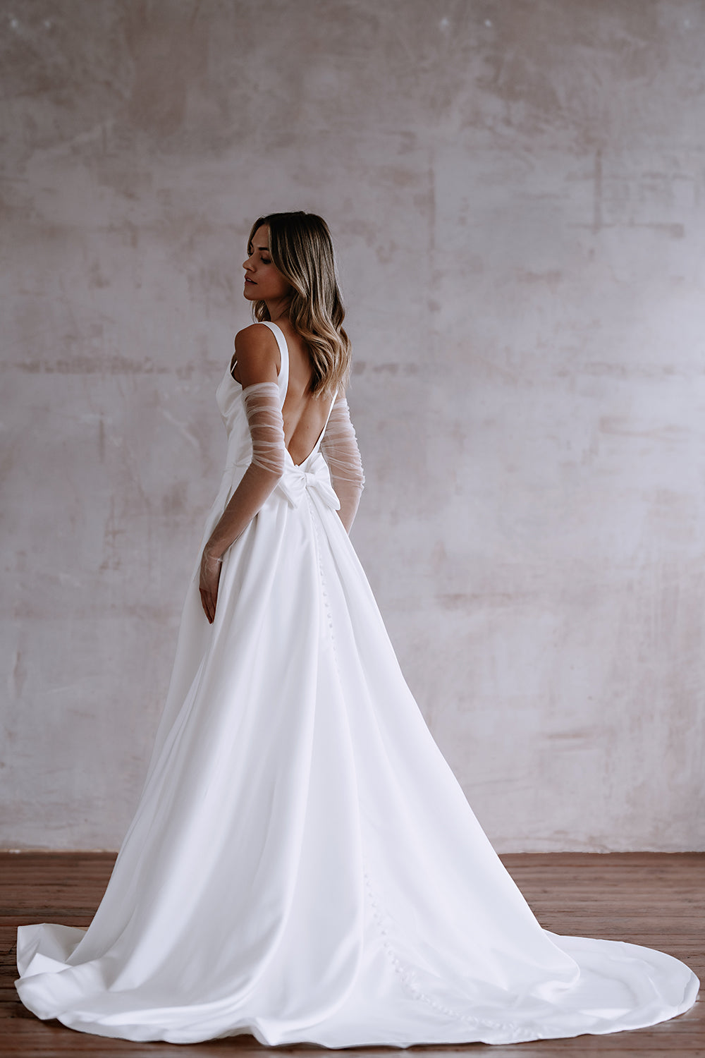
Your outfit is part of the overall aesthetic. A dramatic dress works well with classic décor, while sleek silhouettes pair beautifully with modern settings. Match your dress vibe with décor mood so everything feels unified in photos and real life.
- Compare dress style with mood board
- Match accessories with décor tone
- Keep bouquet style consistent
- Avoid clashing textures
- Think about movement in photos
Pro tip: Try imagining your dress standing inside your venue design.
Why it works: Consistency between fashion and décor creates visual storytelling.
Easy Styling Slip-Ups to Watch For
- Mixing too many color tones
- Overcrowding tables with décor
- Using harsh white lighting
- Ignoring venue style completely
- Choosing trends that don’t match your vibe
- Adding too many statement pieces
FAQs
How do you define your wedding aesthetic?
Your wedding aesthetic is the overall feeling created by colors, textures, lighting, and décor choices working together.
How do you choose cohesive colors?
Start with one main color, add one support shade, and finish with a soft accent. Keep tones similar in warmth.
How do you mix modern and romantic styles?
Use clean shapes for structure and add romantic details through fabric, candles, and soft florals.
How to match decor with venue vibe?
Work with the venue’s natural style instead of fighting it. Enhance existing colors and textures.
What defines a Pinterest-worthy aesthetic?
Consistency, good lighting, thoughtful details, and strong focal areas that photograph beautifully.
Conclusion
A beautiful wedding aesthetic isn’t about spending more — it’s about making thoughtful choices that feel connected. When colors, textures, lighting, and personal style align, your wedding feels effortless and memorable. Keep everything intentional, trust your vision, and build slowly. For more guidance, continue exploring your overall wedding planning journey to make every detail feel beautifully aligned.
Focus Keyphrase
Wedding Planning Aesthetic
Keyphrase Synonym (1)
Wedding aesthetic planning
Related Keyphrase (1)
Pinterest wedding aesthetic ideas
Primary H1
Wedding Planning Aesthetic: How to Create a Cohesive, Beautiful Celebration
Alternative H1s (2–3)
- How to Design a Wedding Planning Aesthetic That Feels Effortless
- Creating a Romantic Wedding Aesthetic Guests Remember
- Build a Pinterest-Worthy Wedding Planning Aesthetic Step by Step
Meta Titles (3)
- Wedding Planning Aesthetic Ideas for a Romantic Cohesive Look
- How to Create a Wedding Planning Aesthetic That Feels Elevated
- Wedding Planning Aesthetic Guide for a Pinterest-Ready Celebration
Power Title (1)
Wedding Planning Aesthetic Secrets That Make Every Detail Feel Luxurious
Meta Description (155–158 characters, keyphrase once)
Soft textures and glowing details transform your wedding planning aesthetic into something unforgettable. Learn simple styling moves that elevate every moment.
high CTR Slug / URL + 3 variation with high ctr
Primary: /wedding-planning-aesthetic-style/
Variations:
- /romantic-wedding-aesthetic-plan/
- /wedding-aesthetic-design-guide/
- /cohesive-wedding-aesthetic-ideas/
Intro paragraph (70–80 words, strong hook)
The room felt still. Then candles flickered. Suddenly everything looked expensive. Most weddings don’t fail because of budget — they fail because the aesthetic feels disconnected. You want guests to walk in and feel warmth, glow, and intention without knowing why. This guide helps you shape a wedding planning aesthetic that feels smooth, romantic, and deeply personal. Step by step, you’ll learn how to turn scattered ideas into a beautiful, cohesive atmosphere people remember.
Conclusion paragraph (65–70 words, warm tone, must include /wedding/decor/)
A strong aesthetic isn’t about perfection; it’s about harmony. When colors, textures, and lighting speak the same language, your wedding naturally feels more emotional and elevated. Trust the small details and let them build your atmosphere slowly. If you want to keep refining your look, gather fresh inspiration and styling ideas through /wedding/decor/ and continue shaping a celebration that feels unmistakably yours.