


Pastel wedding theme ideas are perfect for those who want a soft, romantic, and light feel without heavy decor. Gentle colors like blush, peach, mint, and lavender create a calm and elegant ambiance in every space. This guide shows simple styling tips, flower mixes, and table setups that are easy to copy and budget-friendly.
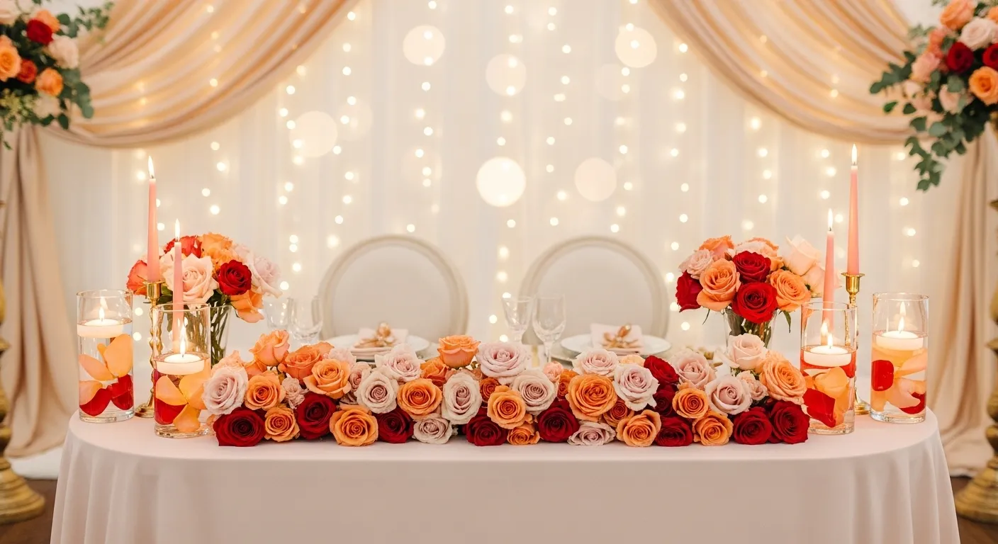
Style blush pink tablescapes
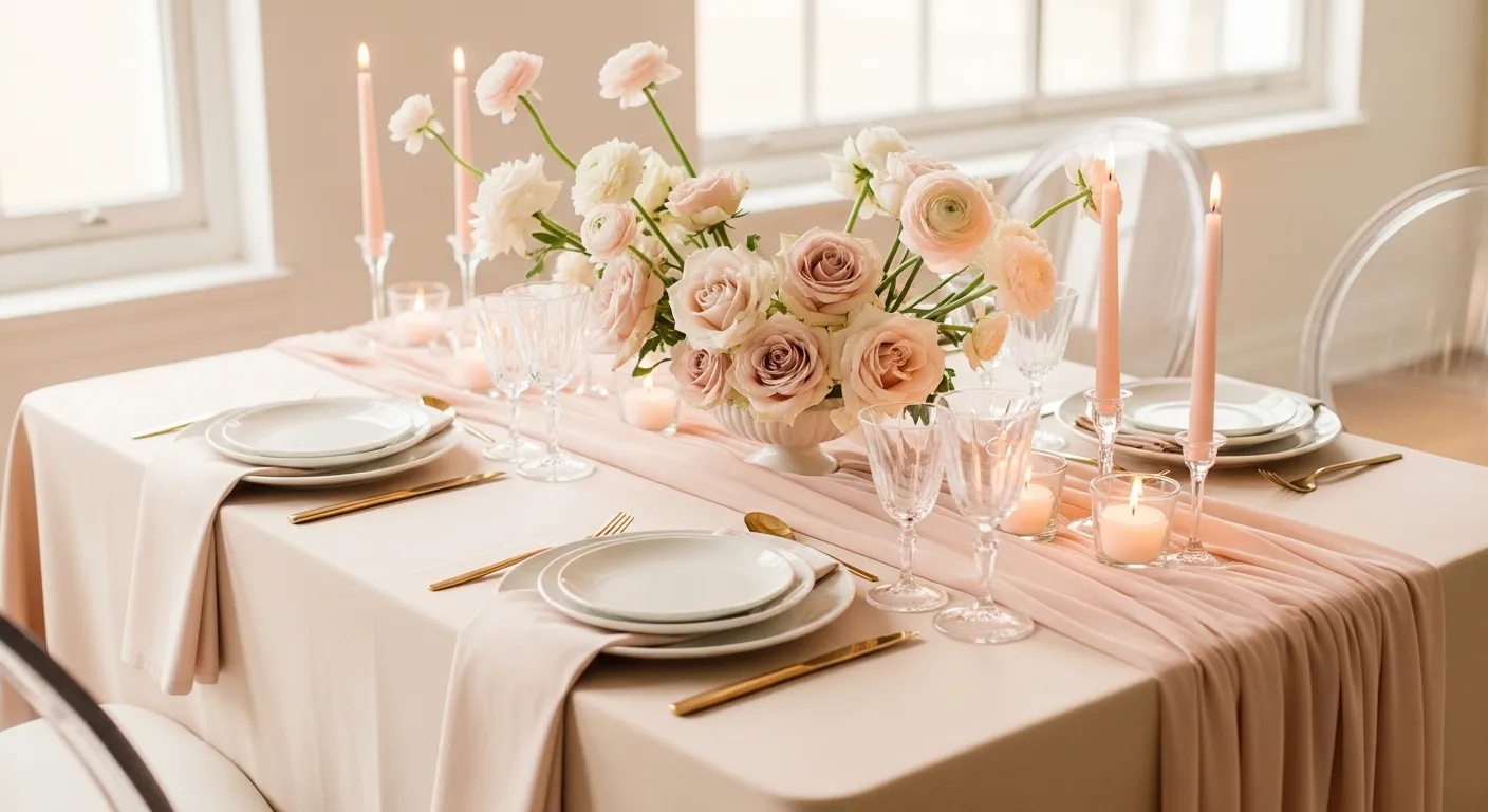
Blush pink sets the tone for the whole room. It feels warm but still light. Start with one main pink layer, then add soft neutrals so the table doesn’t look too sweet. Keep finishes matte or satin for a clean look.
- Use blush linen or runners
- Add ivory plates to balance color
- Choose gold or champagne cutlery
- Keep flowers low for easy talking
- Add clear glass candles
Try mixing two shades of pink only.
Why it works: soft contrast keeps it elegant, not childish.
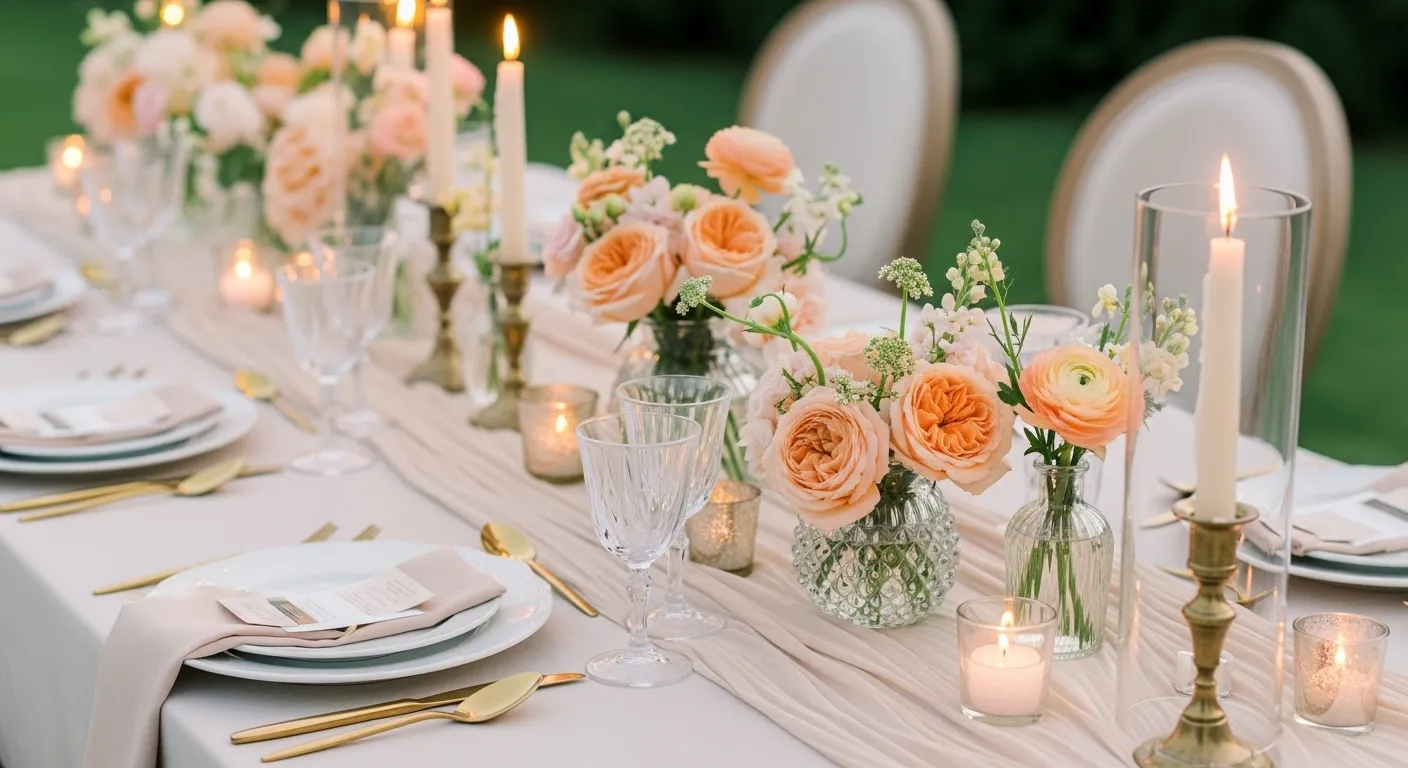
Arrange peach floral centerpieces
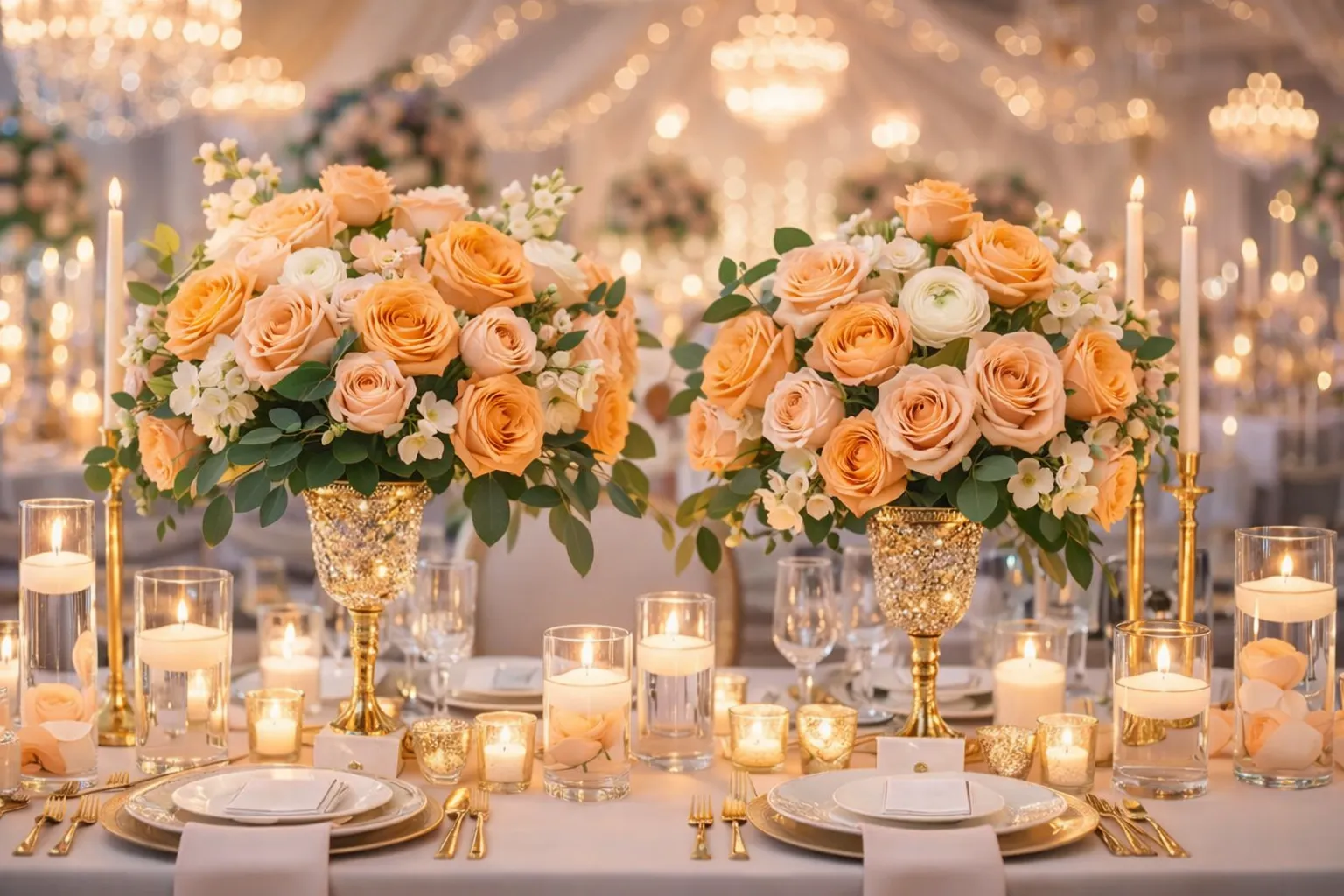
Peach feels warmer than blush and looks amazing in sunlight. It pairs well with cream and greenery. Choose fluffy blooms, so arrangements feel full without using too many stems.
- Mix peach roses, ranunculus, and carnations
- Add soft greenery like ruscus
- Use round low vases
- Keep height under eye level
- Cluster candles around the base
Add a statement table with taller flowers.
Why it works: depth adds interest without clutter.
Fill mint glass vases
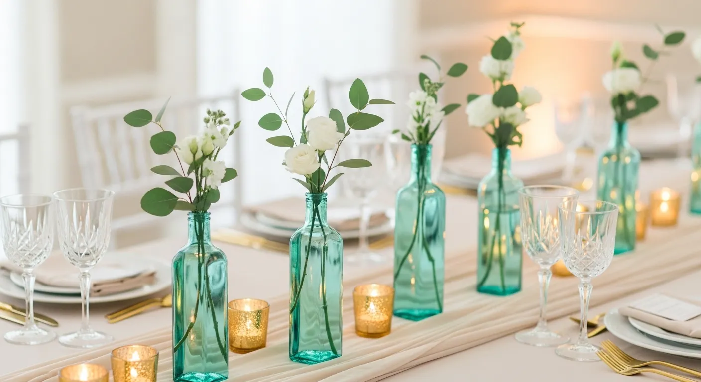
Mint adds freshness. It breaks up all the pink tones. Colored glass already feels decorative, so you don’t need heavy flowers inside.
- Collect mint or seafoam bottles
- Add one or two stems only
- Group in odd numbers
- Place along tables or a bar
- Mix heights for movement
Thrift stores are great for budget finds.
Why it works: light color adds charm without weight.
Style buttercream cake tables
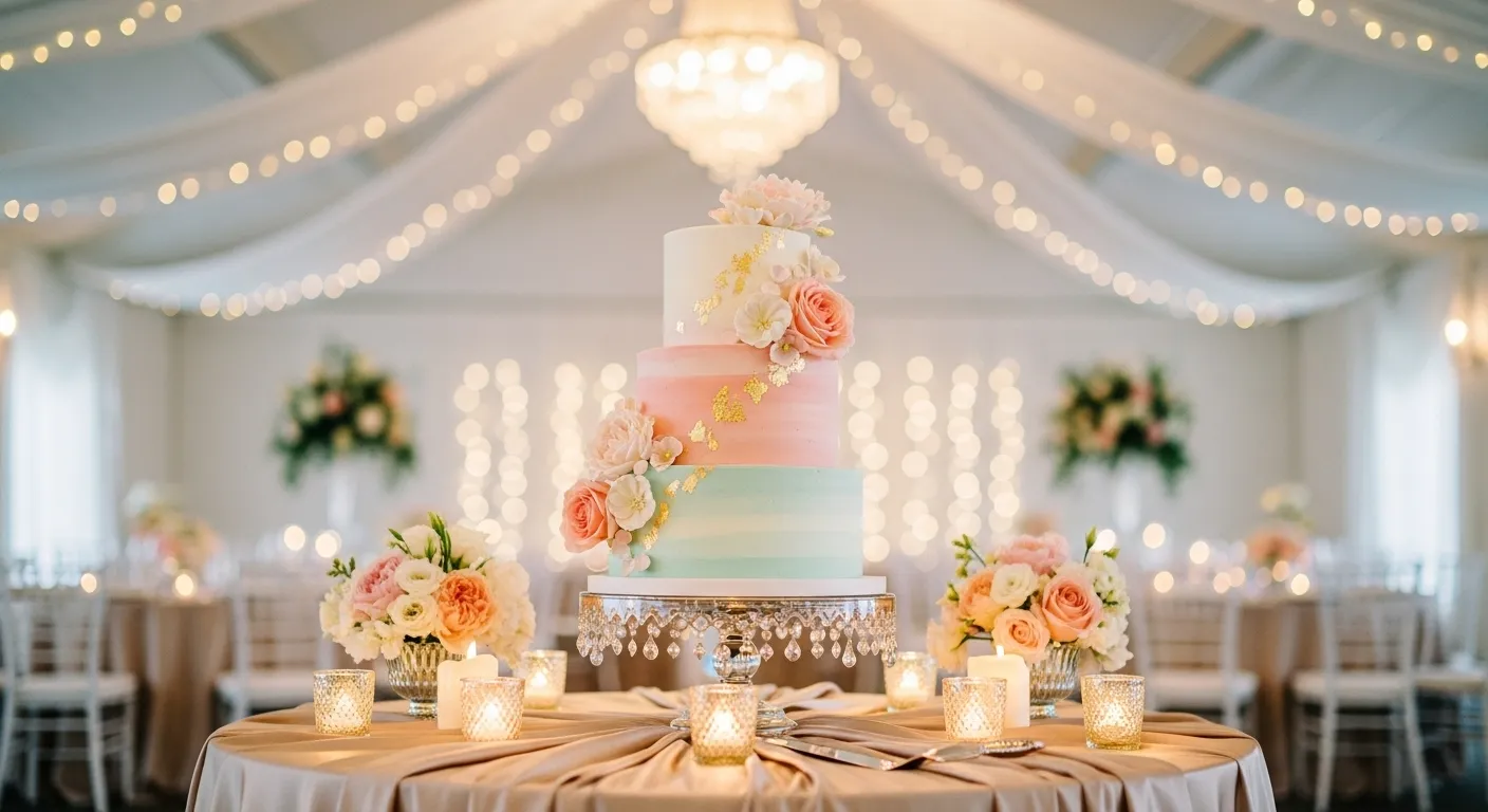
Buttercream yellow feels cozy and happy. It looks soft on camera and pairs well with florals. Treat the cake table like a mini photoshoot corner.
- Use pale yellow or ivory frosting
- Add simple fresh flowers
- Drape linen under the stand
- Include matching cupcakes
- Add soft signage
You can find more spring centerpieces inspiration here: /spring-centerpieces/.
Why it works: warm tones make desserts look inviting.
Layer powder blue linens
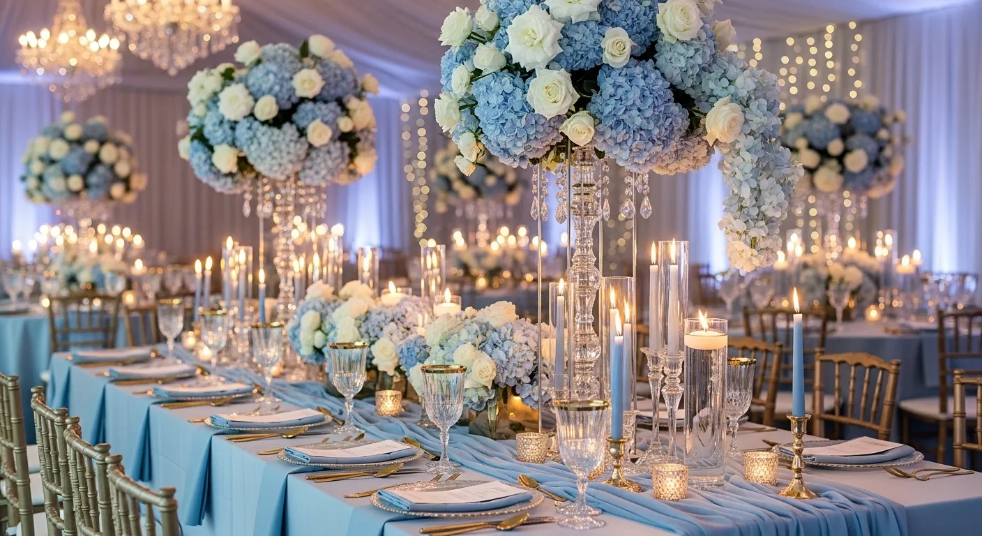
Powder blue cools the palette and balances pink and peach. Use it as a base layer, not the star. Light blues help white decor pop.
- Start with a blue tablecloth
- Add white plates
- Use pale grey napkins
- Add silver or glass details
- Keep florals light
Avoid dark navy nearby.
Why it works: cool tones create calm contrast.
Float lavender bud vases
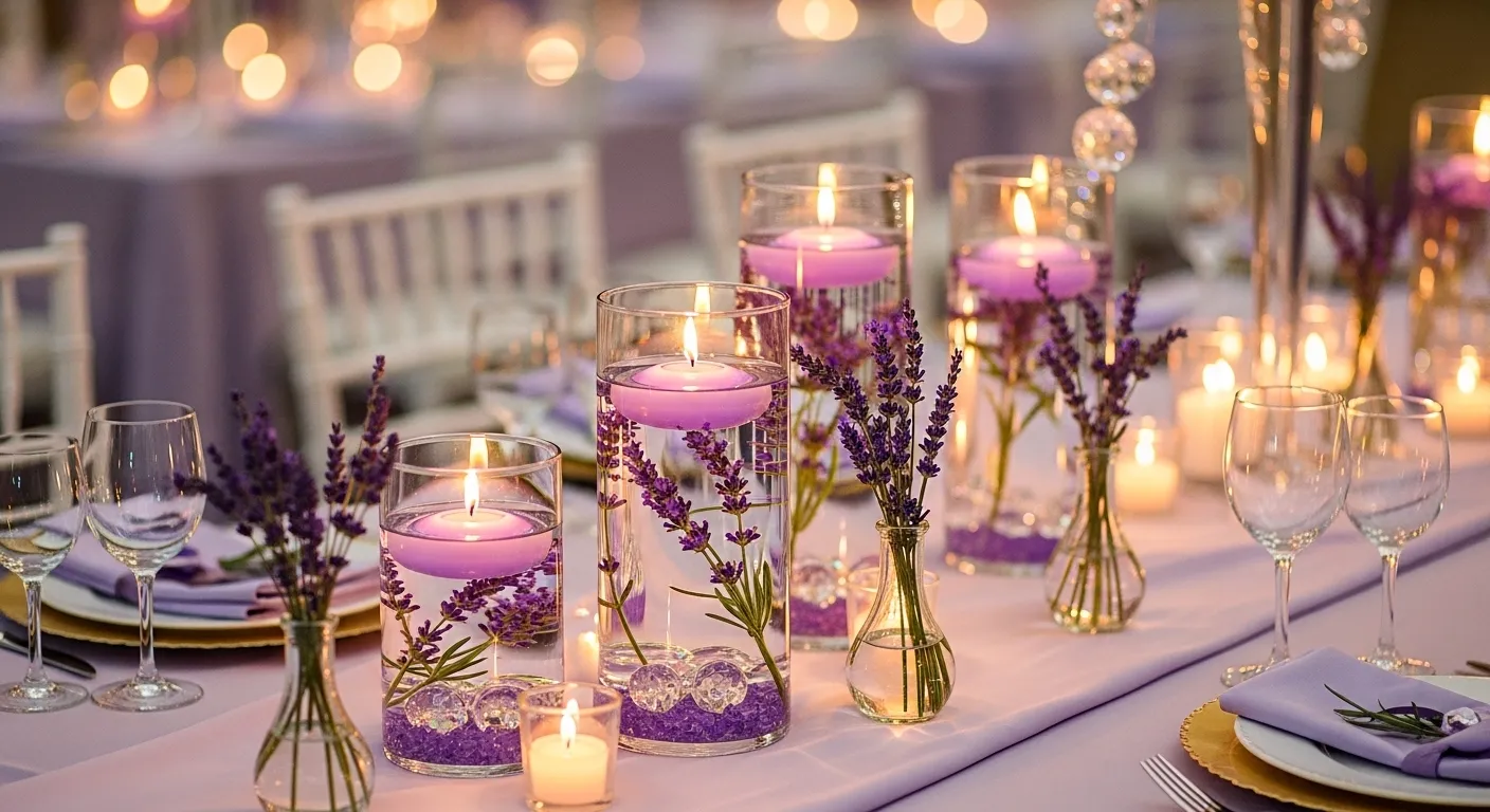
Lavender adds a soft purple whisper. It’s perfect for long tables or aisles. Small bud vases feel delicate and modern.
- Use mini clear vases
- Add one lavender or sweet pea stem
- Space every 8–10 inches
- Mix with candles
- Keep colors muted
Place some on windowsills, too.
Why it works: repetition creates flow across the room.
Run pastel floral runners
Floral runners feel lush and Pinterest-worthy. They’re great when you want fewer vases. Use mixed stems loosely for a garden look. For more soft decor ideas, see /soft-decor-ideas/.
- Use greenery base first
- Tuck pastel flowers randomly
- Leave space for plates
- Add candles through the gaps
- Keep edges messy, not tight
Spray lightly with water to stay fresh.
Why it works: one piece decorates the whole table.
Print soft watercolor menus
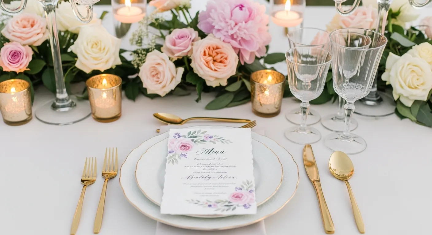
Paper goods tie everything together. Watercolor prints feel handmade and romantic. Keep fonts simple so colors shine.
- Use thick matte paper
- Choose pastel wash backgrounds
- Print minimal text
- Add guest names if possible
- Pair with matching place cards
DIY designs work great in Canva.
Why it works: small details elevate the whole look.
Blend ombre floral mixes
Ombre gives movement and depth. Arrange flowers from light to darker shades. It feels intentional and artsy without extra decor.
- Sort flowers by color
- Place the lightest at the top
- Blend slowly to darker tones
- Repeat in bouquets
- Match aisle decor
Works beautifully with bridesmaid dress colors, too.
Why it works: gradient guides the eye naturally.
Set garden tea tables
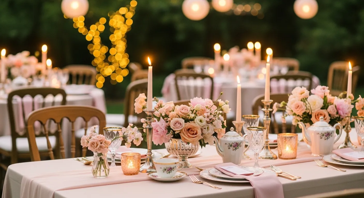
Tea tables feel cozy and personal. Perfect for brunch or outdoor weddings. Mix vintage pieces for charm.
- Use small round tables
- Add floral teacups
- Place mini cakes or macarons
- Add lace or crochet linens
- Include fresh herbs
Great for older guests who want quiet seating.
Why it works: Intimate setups encourage conversation.
Tie baby blue chair sashes
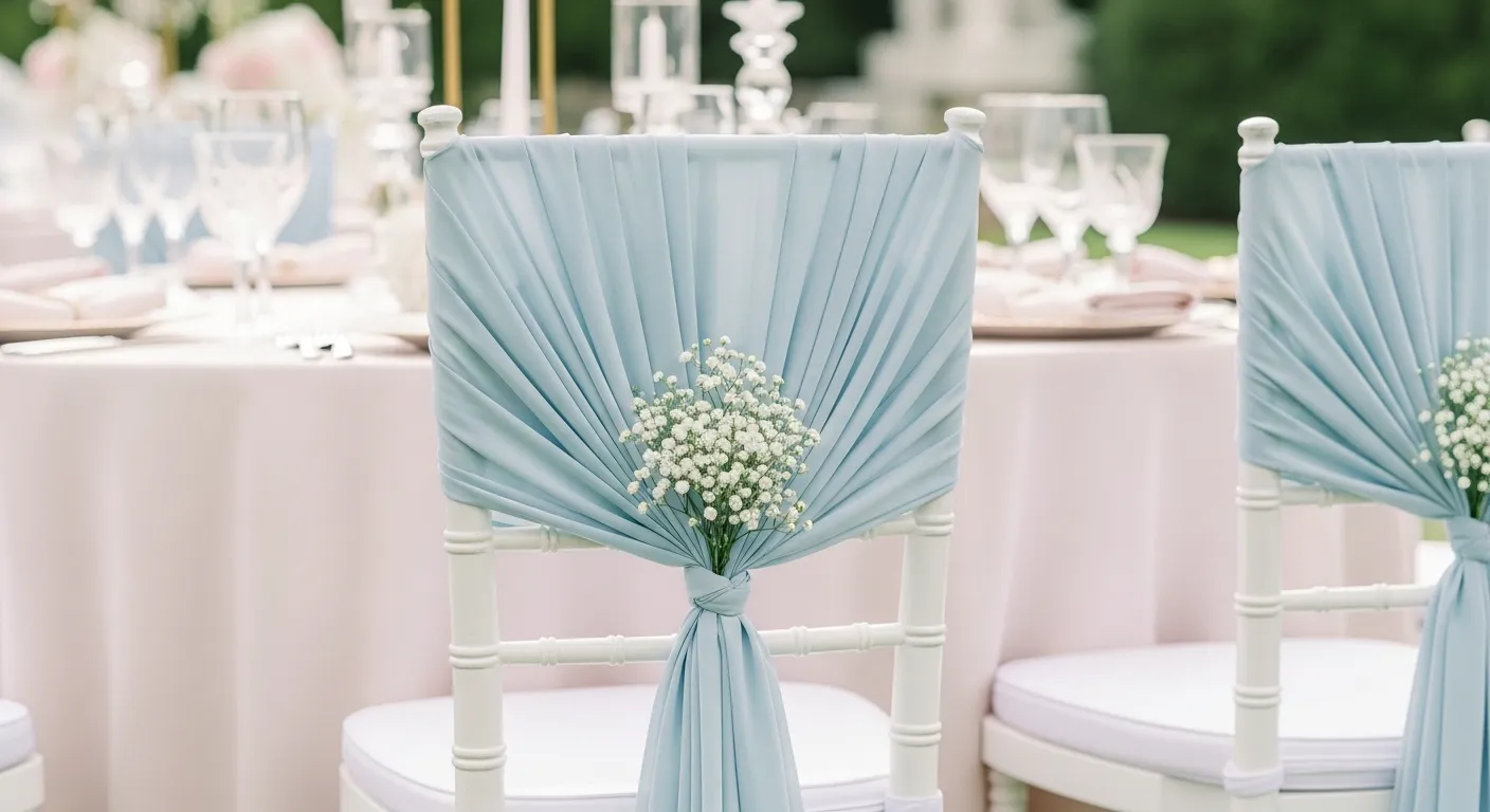
Chairs are often ignored, but cover lots of space visually. A soft sash adds color without cost. Choose flowy fabric that moves in the breeze.
- Use chiffon or gauze
- Tie loose knots
- Keep ends long
- Match with linens
- Space colors evenly
Avoid stiff satin.
Why it works: Subtle color spreads across the room.
Mix peach cream bouquets
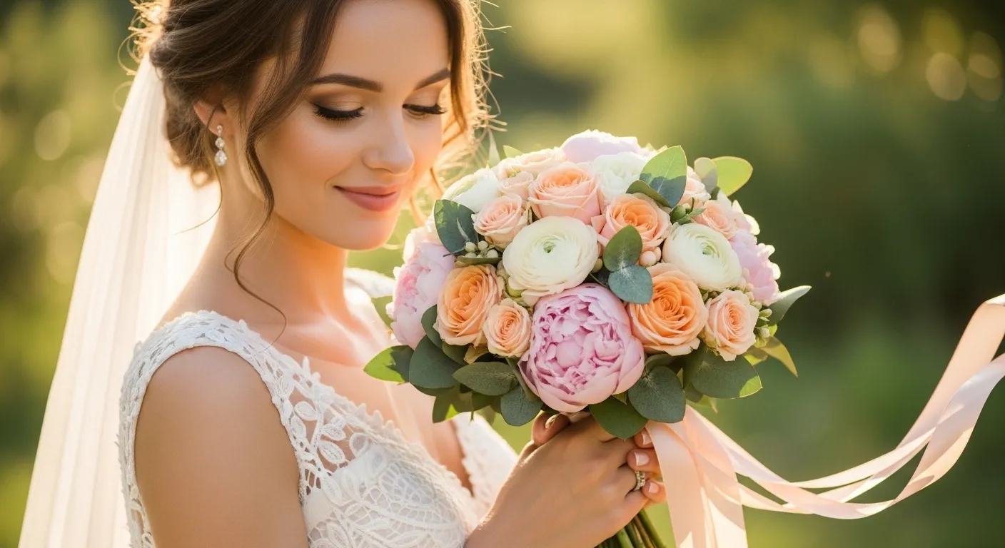
Cream softens peach and keeps the bouquets timeless. It feels romantic and photographs beautifully. Use different textures, not just colors.
- Blend roses and lisianthus
- Add white spray roses
- Include soft greenery
- Wrap stems in silk ribbon
- Keep the shape round
Ask a florist for seasonal blooms to save money.
Why it works: neutral base keeps colors classy.
Drape light airy fabrics
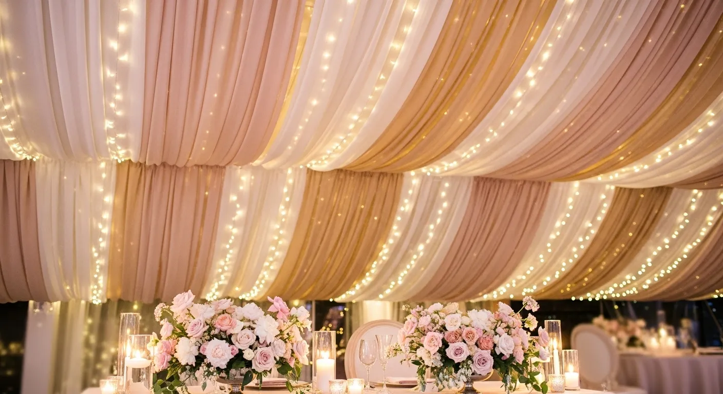
Fabric changes the whole mood fast. Sheer drapes make spaces feel dreamy. They soften hard walls and ceilings.
- Use chiffon or tulle
- Hang from ceiling beams
- Drape behind the sweetheart table
- Add fairy lights inside
- Keep colors pale
Less fabric looks more elegant.
Why it works: softness creates a romantic glow.
Install pastel balloon clouds
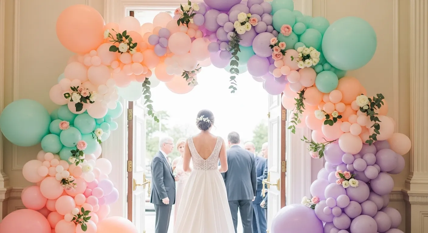
Balloon clouds are fun but still chic if colors stay soft. Mix matte pastels only. Great for photo areas or entrances.
- Choose 4–5 pastel shades
- Mix sizes for depth
- Keep shapes organic
- Add tiny flowers inside
- Place near natural light
Perfect for Instagram photos.
Why it works: playful decor boosts guest interaction.
Things That Can Ruin the Look
- Using too many bright colors
- Mixing shiny and matte finishes randomly
- Overcrowding tables
- Choosing heavy dark greenery
- Forgetting the lighting balance
FAQs
What colors are pastel for weddings?
Blush, peach, mint, lavender, powder blue, buttercream yellow, soft grey, and cream are classic pastel tones.
Best pastel flower combos?
Peach + cream, blush + white, lavender + greenery, and mint + white blooms all work beautifully.
Spring vs pastel difference?
Spring uses fresh bright colors. Pastel focuses on softer, muted shades.
Pastel tablescape tips?
Stick to 2–3 main colors. Use neutrals. Add texture, not more shades.
Best soft color palettes?
Blush + cream + gold, peach + sage + ivory, blue + grey + white are timeless.